Natural gas & LNG Analysis
Montney growth needs two charts: productivity and decline
A larger contribution to Canadian gas supply tells one story. The production history of successive well groups tells another—and helps frame the next investment question.
What matters
- CER reports Montney tight gas accounted for 45% of Canadian gas production in 2024, compared with 22% in 2015.
- A well’s early production rate and its later decline describe different parts of performance.
- CER’s future production shares are scenario results, not observed output or guaranteed deliveries.
The Montney’s growing contribution to Canadian natural gas supply is a useful starting point for research into wells, infrastructure and demand. It should lead to two separate charts: one showing production across the basin and another showing how well output changes after production begins.
The CER’s September 23 snapshot reports that Montney tight gas supplied 45% of Canadian gas production in 2024, compared with 22% in 2015. Its average-well comparisons show higher early production rates in more recent well groups. The snapshot also presents future production shares from the Energy Futures 2026 Current Measures scenario; those are conditional projections.
A share can change for more than one reason
The historical values in CER’s snapshot give the scale of the change: Montney tight gas rose from 3.3 billion cubic feet per day in 2015 to 8.3 in 2024, while the national total rose from 15.2 to 18.3. Calculated from those rounded values, Montney output grew approximately 152%, compared with approximately 20% for the national total. The formation’s rising share therefore reflects growth that substantially outpaced the total over those years.
A basin’s share is its production divided by the national total. The share can rise when its own output grows, when output elsewhere changes, or through a combination of both. A share chart is therefore most useful beside the underlying volumes.
There is a similar distinction between a regional total and an average well. A producing region can grow because more wells are contributing, because wells perform differently, or because the mix of assets changes. An average-well chart does not, by itself, identify the complete reason for the regional result.
A careful comparison would put annual regional output, the number of contributing wells and well-group performance beside one another. It would also state how the groups were selected. A difference between averages does not establish the result for every individual well.
Early output is not lifetime output
A high initial rate describes the beginning of a production history. It does not directly measure total recovery, the length of the productive period or the cash generated over that period.
Consider two hypothetical wells. One starts at a higher rate but falls more quickly. The other starts lower and declines more gradually. The higher starting point alone cannot establish which one produces more over a full period. The time profile is essential.
That is why a decline chart should show comparable time since first production, rather than mixing wells of different ages on one calendar date. It also explains why a cumulative-production view can answer a different question from the initial-rate view.
Productivity and economics require different evidence
Better output performance can be significant without settling the investment calculation. Cost, market price, liquids production, transport access and operating constraints all matter to a company’s result. A production curve cannot supply those missing inputs.
For services businesses, the useful research question is similarly specific. Does a development program imply more drilling, a different completion design, more processing demand or a change in maintenance work? That connection should be traced through project and company evidence rather than assumed from national production growth.
AER’s daily well-licence records can identify licensing activity. A licence is a different milestone from drilling, completion and production. Counting it as a producing well would create a misleading activity measure.
Treat the future as a scenario
A scenario connects possible supply with assumptions about prices, markets and other conditions. Its value is that those relationships can be examined. A projected share should remain labelled with the scenario and publication vintage.
One useful follow-up is to compare subsequent observed production with the projected path, while separately tracking infrastructure and demand milestones. That avoids treating a modelled volume as a booked export, an operating terminal or a producer’s committed plan.
The Montney story is therefore broader than “wells are getting better.” The substantive questions are how performance changes across comparable groups, how that affects regional supply, and whether the supporting commercial and physical systems develop alongside it. Each step needs evidence of its own.
Original illustrated learning
Build the background
Follow a gas-compression train
Read the guide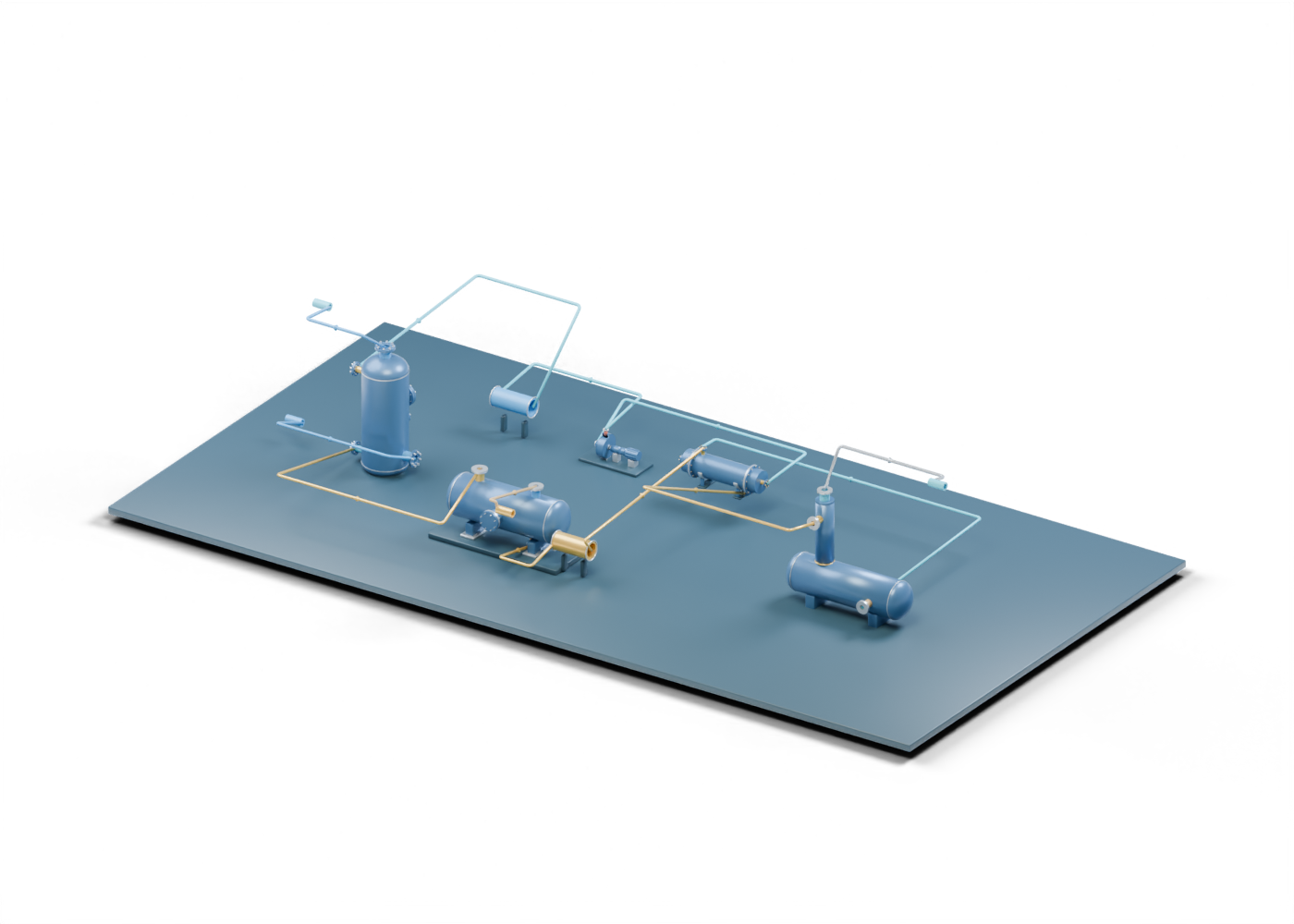
Trace a glycol dehydration and regeneration circuit
Read the guide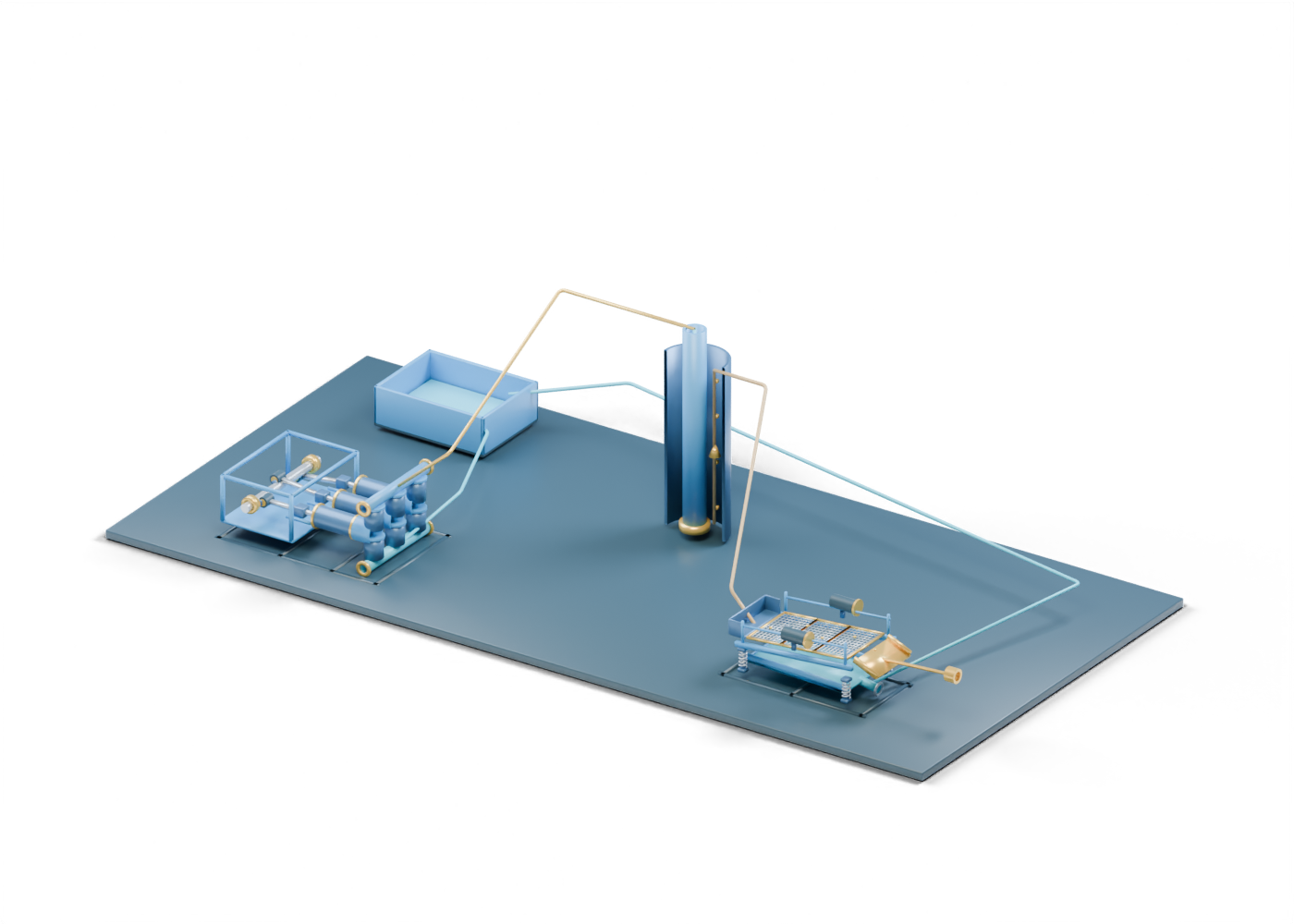
How drilling fluid moves: pump, well, returns and shaker
Read the guideThese are original educational concepts, not manufacturer designs, certifications or operating instructions.